What do birthday calendars, Lonely Planet travel guides and concert line-up posters have in common? They all explain a step-by-step process in a visual, structured way. Because that’s what our brain – with its short attention span – craves, to be able to make sense of complicated timetables. So, let me help you visualize your business’s roadmap by looking at how others have done this.
Want happy customers? Then manage their expectations.
Living up to the needs of customers is cut-and-dried when expectations can be met within minutes. For example, being served the meal you have ordered at a restaurant. Or waiting for your car to undergo maintenance. In these cases, fulfillment takes place shortly after the request. And it is pretty clear what needs to happen for the customer to be satisfied. Chance of surprise is low.
Meeting expectations becomes more of a challenge when fulfilling needs takes days or even weeks, and when the desired outcome is uncertain.
Imagine hiring a contractor to remodel your entire bathroom. First, you discuss different bathroom designs and agree on a price. Then, the contractor starts planning the project. Two weeks later, workers arrive at your doorstep. They take a few days to demolish and rebuild your bathroom.
What are the odds that everything goes swimmingly?
With an increasing amount of moving parts and a longer timespan, the chance of unpleasant surprise goes up. Add a lack of communication and drama will likely unfold. If you have had your bathroom or kitchen remodeled before, I bet you would agree.
Meeting expectations is similarly challenging when your business tries to involve customers in the decision-making process – to improve your products and reputation. It takes a while to have an open conversation with customers and to reach goals together. Over time, expectations and outcomes may unknowingly diverge, which could lead to disappointment. To avoid this from happening, constantly help your customers understand how they are involved, what to expect of the outcome and how long it will take to get there.
How best to convey all this progress information? Well, with visual roadmaps of course!
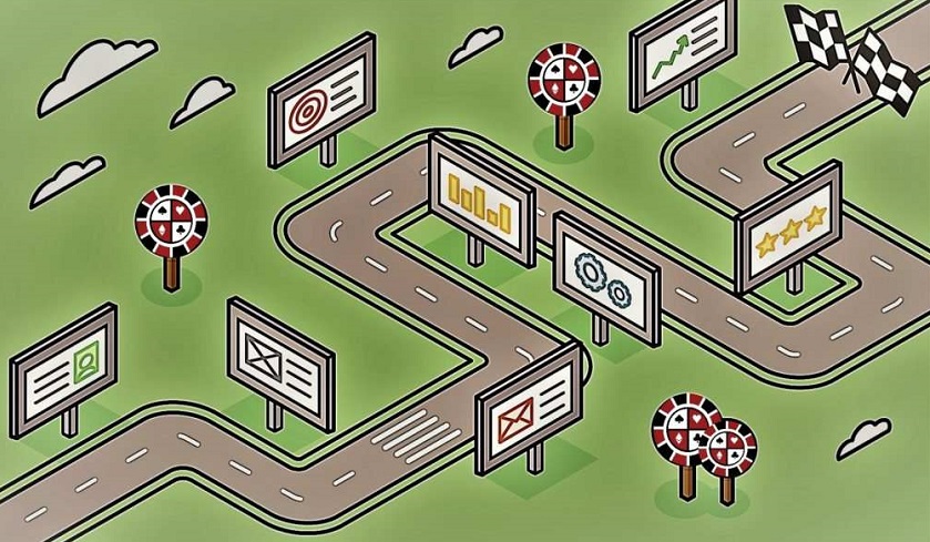
When you want to grab people’s attention and make sure the message sticks, visualizing time-related information is key.
The relevance of the information and the way it is being presented go hand in hand, though. In other words: substance and design are equally important. One does not exist without the other. Raw, unfiltered information simply goes unnoticed. Just like fancy design without a meaningful message remains a hollow shell.
Let me show you what I mean, by looking at some inspiring examples of visual presentation of timelines and phases.
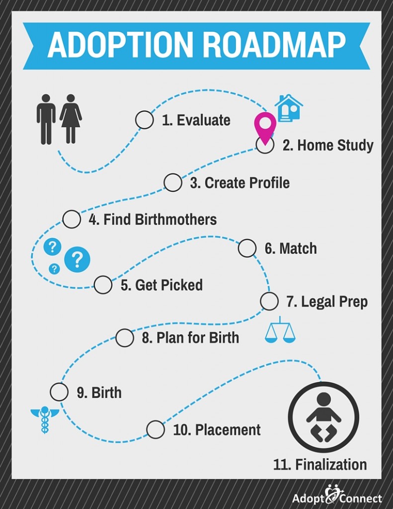
1. Adopt Connect: step-by-step process
To start out simple, an example from Adopt Connect, which offers adoption guidance. As you can imagine, adoption is a thorough and time-consuming process. Many steps are involved. In addition to a detailed explanation in plain text, they have also added a visual roadmap with a summary of the steps. Look at it as virtual handrails that you can hold on to when you are drowning in information.
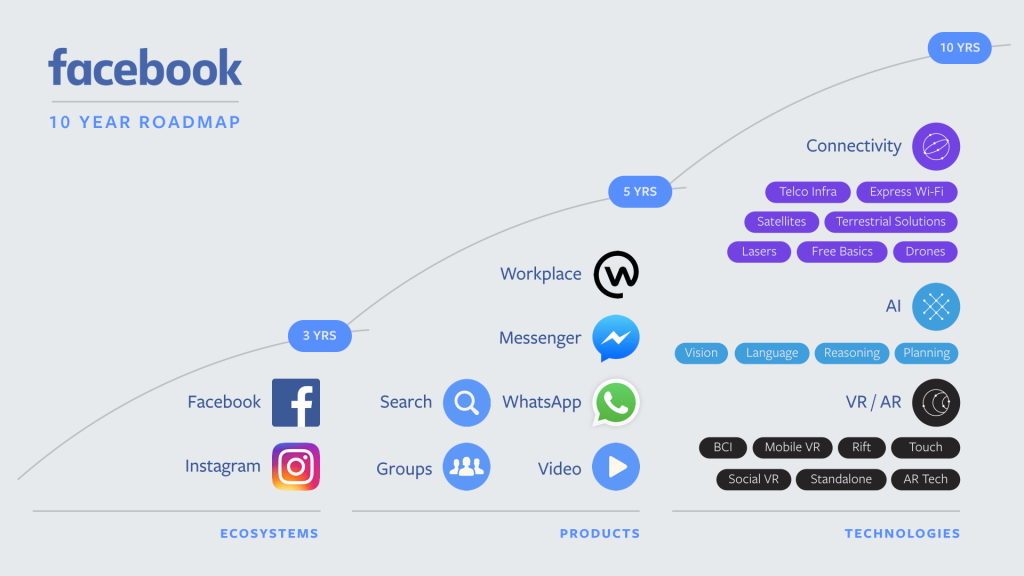
2. Facebook: future milestones
Recognize this one? It is a roadmap used by keynote speakers Mark Zuckerberg and Mike Schroepfer during Facebook’s F8 developer conferences. The visual shows the company’s goals for the next 10 years. The simplicity of the timeline presented on screen helps the audience to connect the dots in what is being said on stage.
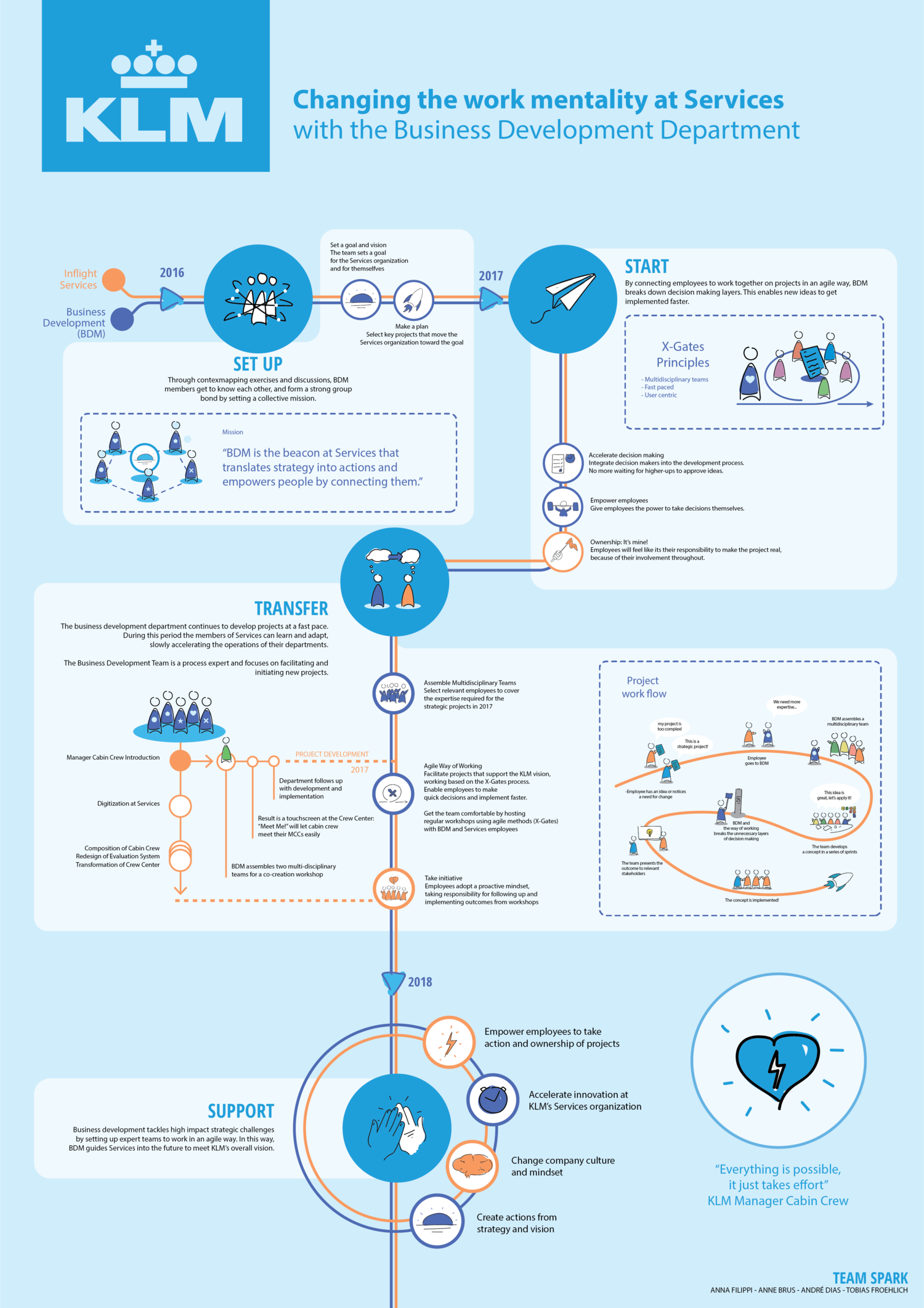
3. KLM Royal Dutch Airlines: a well-structured plan
Running a lengthy project comes with lots of challenges, one of which is keeping everyone aligned to reach the final goal post. A project team at KLM had the right idea: they designed a complete visual planning. Obviously, most of the information on this roadmap only makes sense to insiders. The takeaway here, though, is that a visual one-pager of a plan can be an effective addition to traditional project management (reporting).
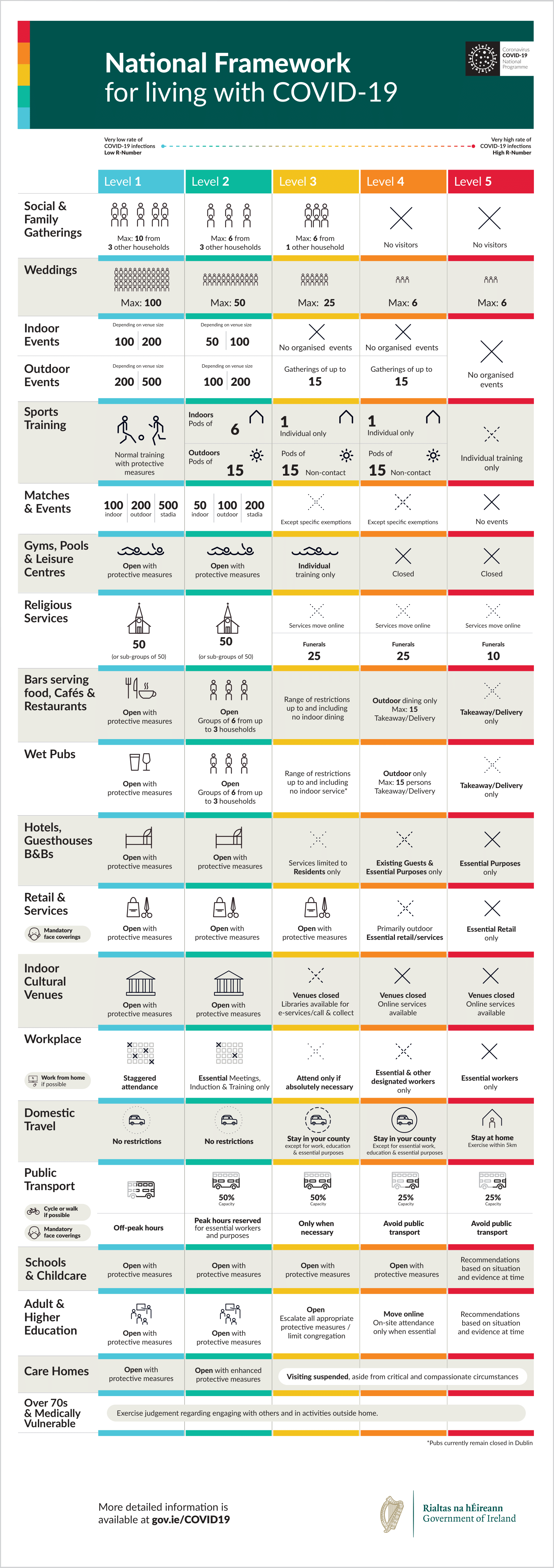
4. The Irish Government: phases
While I am writing this, the coronavirus pandemic still has a chokehold on our planet. Aside from increased hospital capacity, vaccine development and economic relief, beating COVID-19 also requires clear communication by governments. Because, the rules in the public space are changing constantly and they will only help if everyone complies.
In their attempt to keep citizens informed, countries from all over the world resort to roadmaps. On these roadmaps you will often see columns with phases that will tell you which restrictions and guidelines currently apply. High viral spread: lockdown. Lower viral spread: gradually open up again.
Ireland has been leading the pack within the international community on clear communication. Its straightforward infographic, that explains under which circumstances lockdown and reopening will occur, became the template for other countries, like The Netherlands.
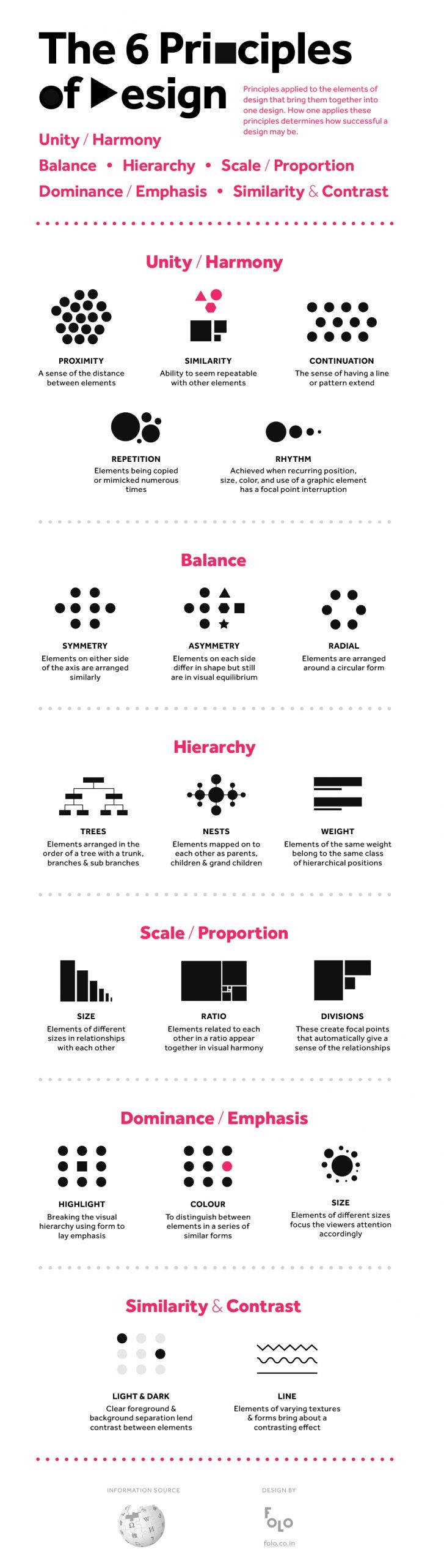
5. Folo: visualize everything
In the end, any message that you send out can be visualized, or at least supported by visuals. There is no limit to it. Even entire Wikipedia pages have been turned into infographics to make information easier to digest. India-based designers collaborative Folo has done exactly that, with its visual summary of the Wikipedia page about the principles of visual design. I picked this example not only to make my fifth and final point, but also to send you off with the basic tools needed to create amazing roadmaps of your own. Good luck!
Also read: ‘Creating the kind of content that will get you noticed’